

Adverts We Love
This is an on-going chain of adverts we have seen on the internet that we love, for any variety of reasons.
Cool ads, stop-you-in-your-tracks ads, beautiful simplicity, great hooks – whatever the why, here they are (newest first):
Google Adwords:
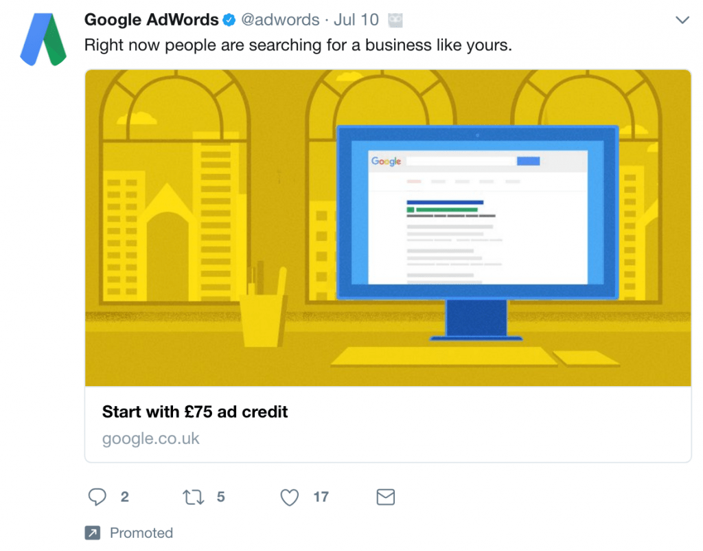
- Simple benefit
- Simple hook
- Of benefit to the viewer
- Interest first, Desire too
Note we also give away free ads to clients who are new to Digital Advertising. 14 days of free ads (more than £75 worth!).
Harry’s:
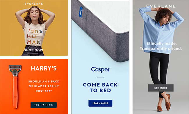
- Simplicity!
Indochino:
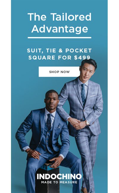
- Simple!
- Pricing
- Quality

Poop N Scoop:
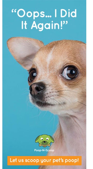
- Simple message
- Cute pet
- Quality design
- Simple design
- Winner!
Espon:
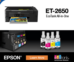
- Contrast is good. You should always consider having a good contrast between the images.
- Easier to stand out from the crowd.
- Good design.
LENSCRAFTERS:
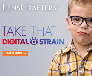
- Nice use of fonts to make the message be visible.
- Simple design.
Hornitos:
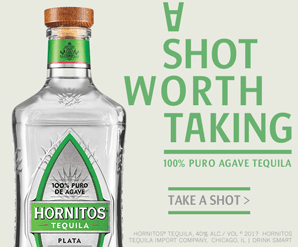
- Creative and beautiful design.
- The message which catches the viewer’s attention.
- An impression of professionalism.
Adobe:
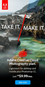
- Beautiful in design.
- Great looks.
- Nice colour combination.
- No other better testimonial than the product itself.
Nike:
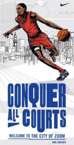
- Cool graphics.
- Simple.
- Nice use of fonts.
Yahoo!
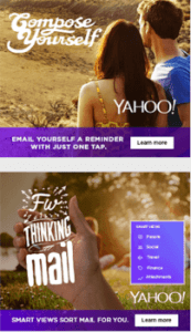
- Creative use of fonts.
- Beautifully designed.
Dell:
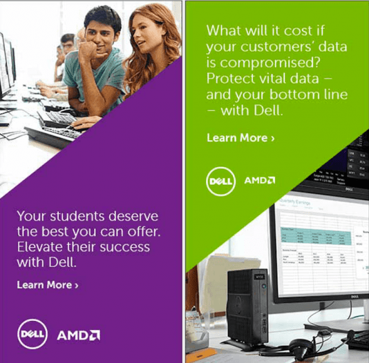
1. A good example of how to use colours in your banner ads.
2. High-quality images, a simple colour as a background and their logo.
MailChimp:
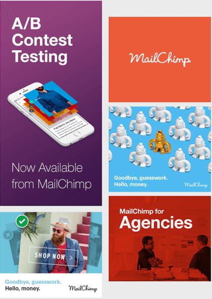
1. A good example of how to use banners ads to increase brand awareness.
2. Creative design.
Microsoft:
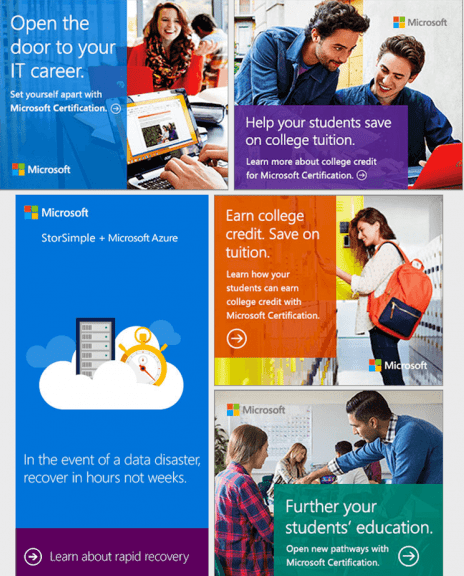
We love the way the Microsoft designed their banner ads by using a certain percentage of transparency on the coloured shape that’s underneath their message and how they connect with the user by showing different possible real-life scenarios.
Netflix:
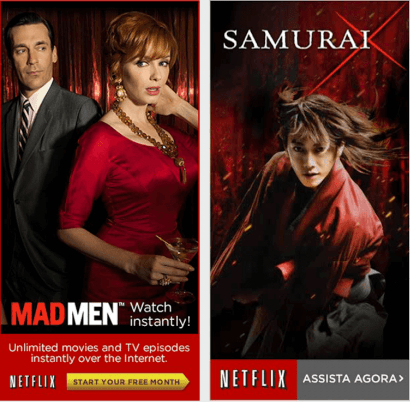
1. This ad reminds you to look at your favourite TV series on Netflix.
2. They are using their ads to promote their TV series.
Apple Music:
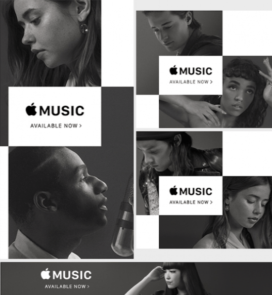
1. Simple Design
2. Highlighted Logo
Cisco:
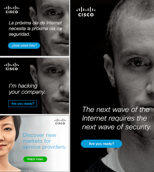
1. Powerful message and visuals.
2. Simply designed
Facebook:
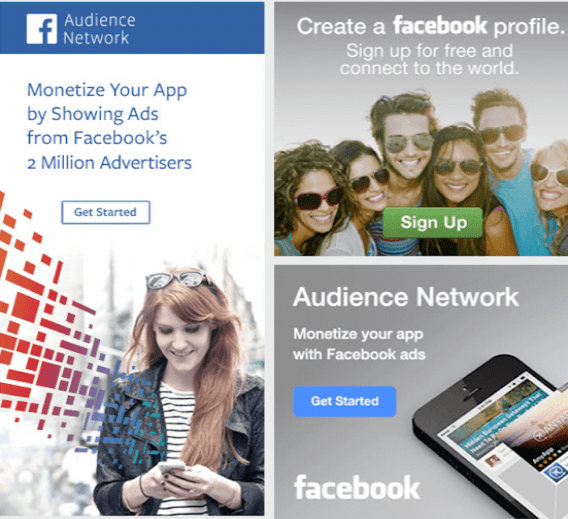
They have done a great job telling the business owners and marketer how to monetize their app with Facebook ads.
IBM:
1. Excellent use of colour and beautifully designed.
2. CTA button is at the bottom with a longer message and an arrow is guiding that to know more just click here.
Airbnb:
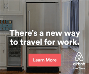
This ad is clean and simple with an interesting image and one sentence of contrasting text. The call-to-action button is in a bright, eye-catching colour and subtly asks people to “learn more” rather than a more direct “book now.”
Visit Pensacola:

The image here is everything – a young couple hand-in-hand in the ocean with a sunny blue sky behind them. There’s no better way to sell a vacation destination.
Tableau:
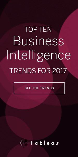
This ad is darker than our other examples, but the simple geometric design is pleasing to the eye.
Samsung:
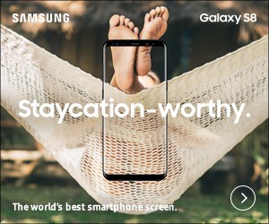
Bold image and features minimal text. You can just imagine someone taking this photo to put it on Instagram or Snapchat.
eBay
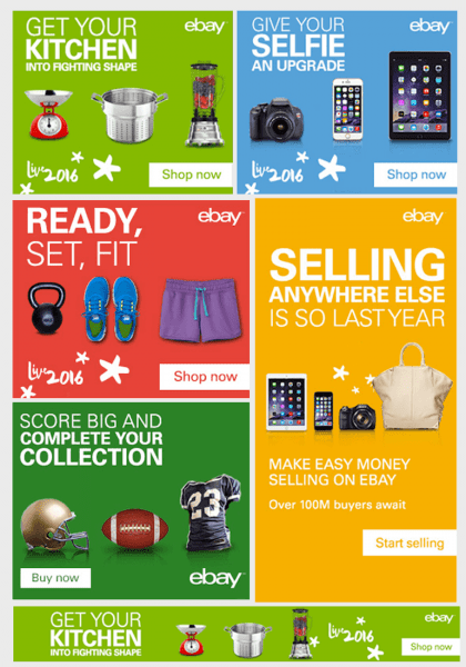
They are selling an emotion and also they are creating a need in every user mind that is seeing these banner ads.
AOL
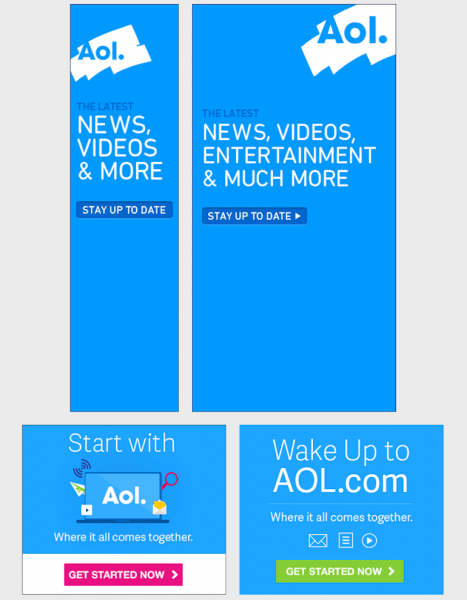
AOL is using a wonderful color and a simple message.
Intel
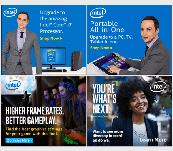
Simple but efficient design.
Casumo:
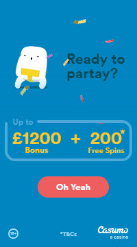
A clear theme across all its advertising. A cute creature in animation who also dances.
MSC Cruises:
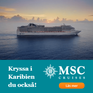
It’s an excellent example of how to use static elements with in-banner video. Good Background.
Color Line:
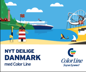
This banner by Norwegian ferry company Color Line is beautiful. Simple, yet eye-catching creating a typical summer postcard-like feel.
Shutterstock:
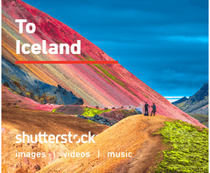
Shutterstock has access to millions of high-quality images which it uses to captivating effect in the design of its display advertising. Its always-on campaigns use high-quality imagery and bright colours to effect.
Elko:
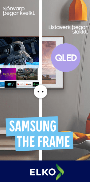
Elko’s unique ad campaign uses a Rich Media slider to showcase the capabilities and placement of a Samsung Frame TV in the real world. This simple interactive feature not only got viewers to engage with the ad but increased click-through rates for Elko too.
Ladbrokes:
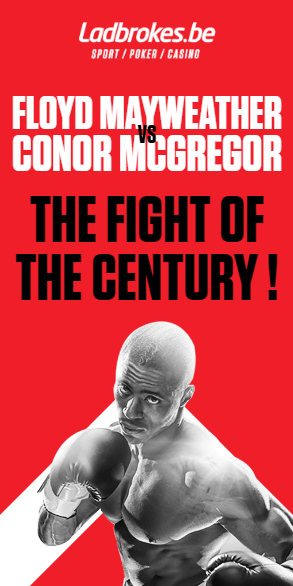
With a striking palette of black, red, and white, Ladbrokes Belgium’s HTML5 banner ad for the Mayweather Vs. McGregor is a knockout.
MailChimp:
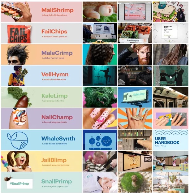
Nine different projects were created to rhyme with the brand’s name. One thing that stands out about these examples is that they commit to one direction, spark interest by connecting with a feeling, and let their linked landing page do the rest.
Bing:
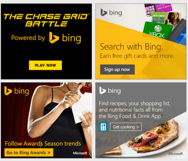
If you see at these banner ads, there are 3 situations: a brand that is proud of the project it is sponsoring, a brand that creates emotion and a brand that sells a promise.
And when you see a brand in one of these 3 situations, that means it is on the right direction.
Dropbox:
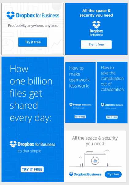
Blue and white colour combination makes the banner attractive. But what we actually love about Dropbox’s banner ads is the great and creative headline talking about the benefits of using their product.
Evernote:
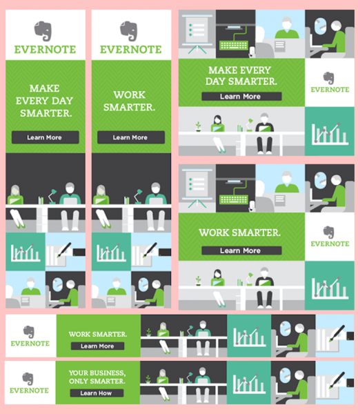
Evernote is a great tool for every marketer or businessman should use. And the message you find on their banner ads is either “Work Smarter” or “Make Every Day Smarter”.
This ad has a great Landing Page too, see our 100 landing pages post.