
Some Examples Out There On The Internet, Working
It’ll get to 100 with time 🙂
We’re going to add our favourite Lead Pages here on a regular basis.
For our clients, we use LeadPages.net
Newest at the top.
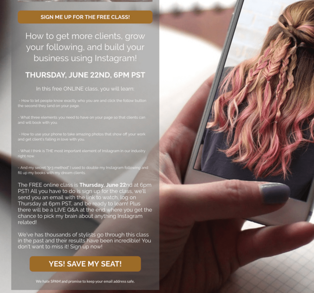
- VALUE to the visitor – something free, something useful!
- Clear call to action

- Statistics – something for the brain to peg against.
- BENEFIT to the visitor.
- 1 clear call to action. Simple.
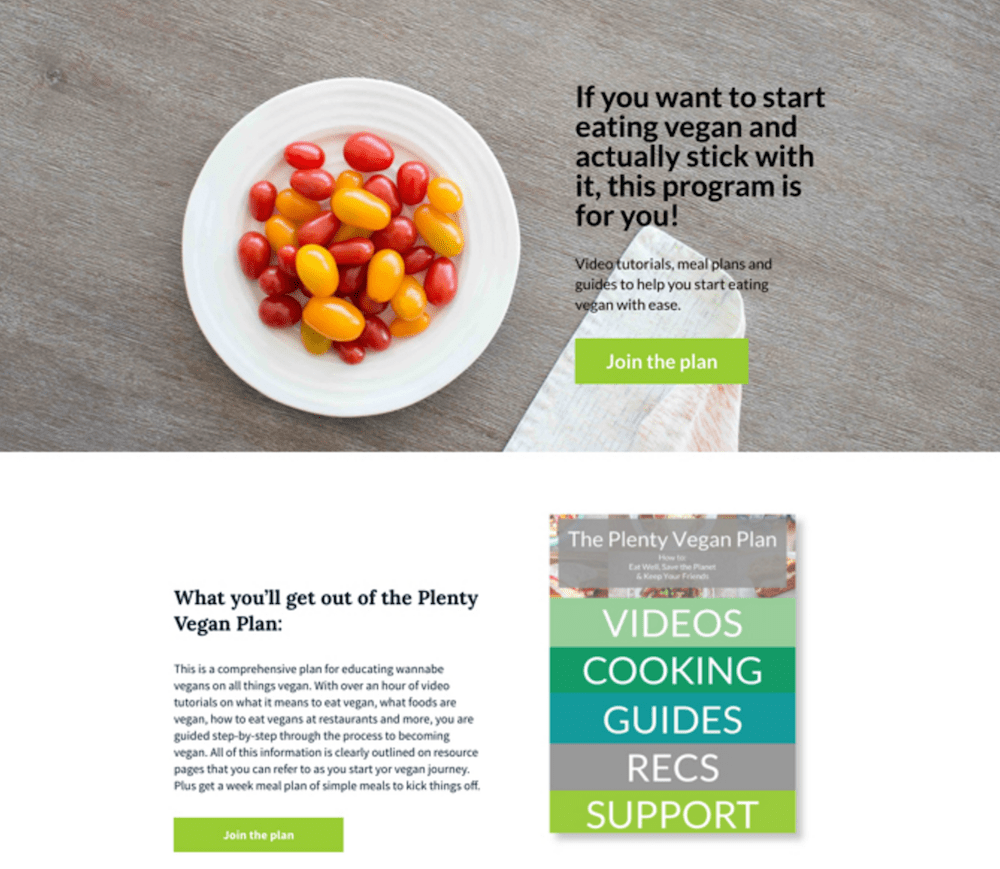
- Useful to the visitor!
- Clear what I will get: video tutorials, meal plans & guides
- Clear call to action
GOALIE COACHES:
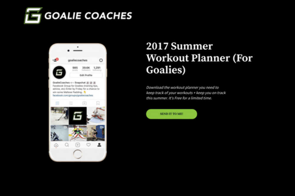
- Clear what I get
- Useful to me (if I was a goalie!)
- Subtle time pressure: this works
- Bright, clear call to action
Quora:
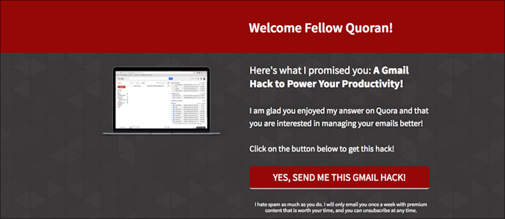
- Really simple!
- Useful to audience
- Very targeted audience – commenters on the topic
- Guaranteed to convert well
Poop N Scoop:
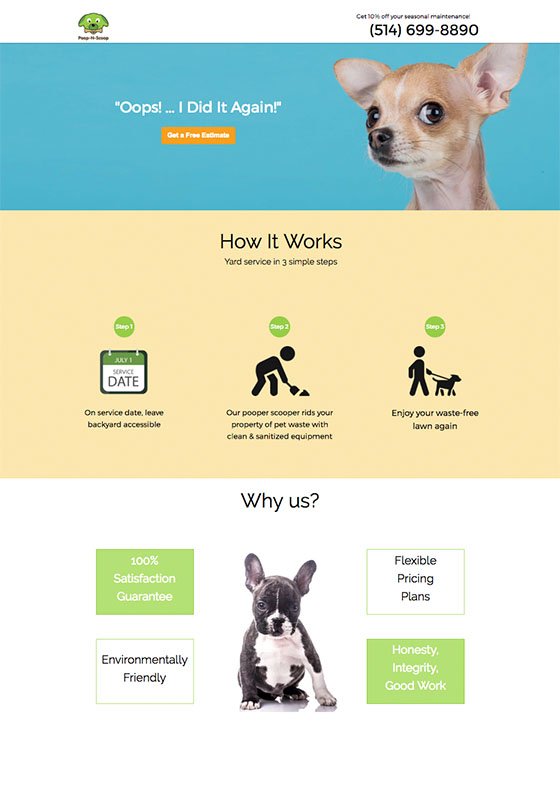
- Simplicity!
- 1, 2, 3 convert – easy for the brain to handle in 5 seconds!
Adespresso University:
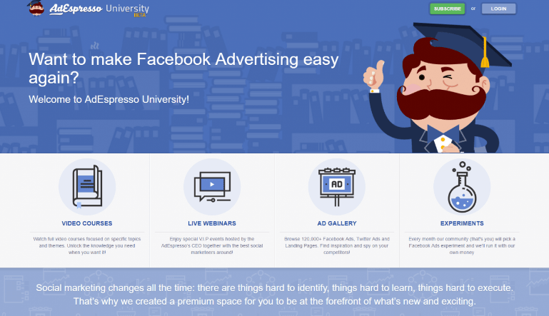
- Simplicity.
- Clearly visible options at the bottom.
Slack:
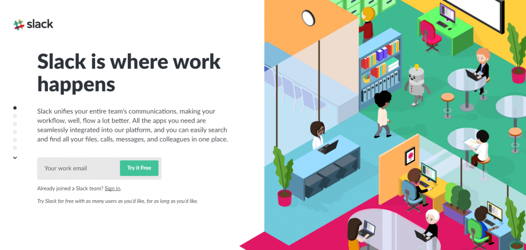
- Nice colour combination.
- Beautiful design.
- The images are bright and engaging.
Salesgenie:
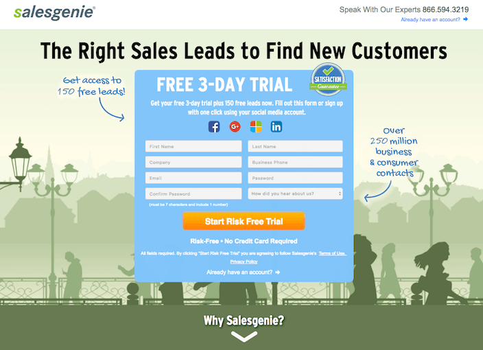
- The headline is showing a clear message.
- Good background.
- Simple design.
UBER:
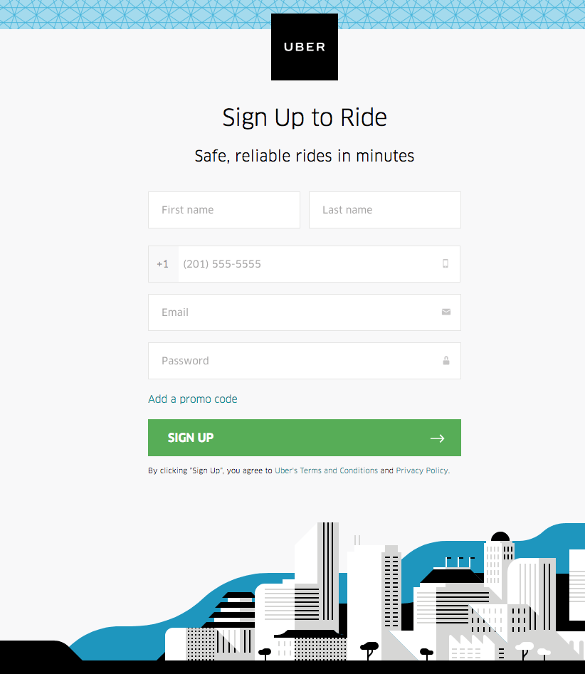
- Simple design.
- Nice graphics in the footer.
- 5 form fields are good for a signup page.
Hubspot:
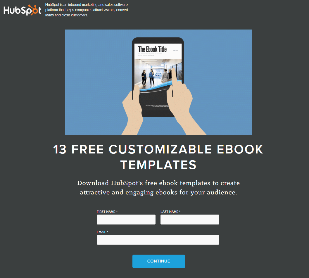
- Simple design.
- The message is clearly visible.
- Only have to fill 3 fields to continue for 13 free Ebook templates which may attract visitors.
GEICO:
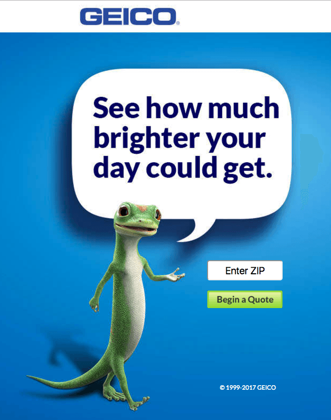
- Cute creature.
- Very simple design.
- Clear message.
Online Trading Academy:
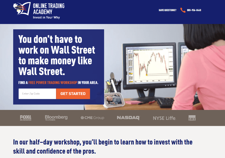
- Beautifully designed.
- Nice use of fonts to show an important message.
- Only have to enter the zip code to get started which is really simple.
Walk me:
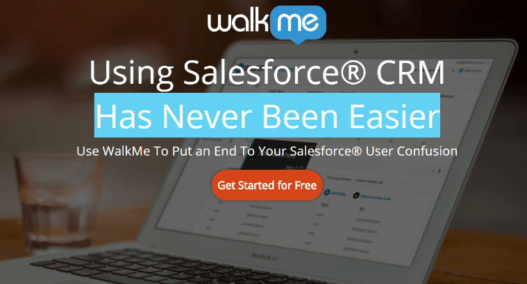
- The blurred background is attractive.
- Highlighted fonts.
Final:
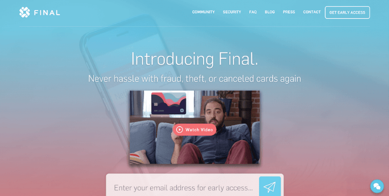
1. Video in the centre.
2. Transparent background.
Flynn:
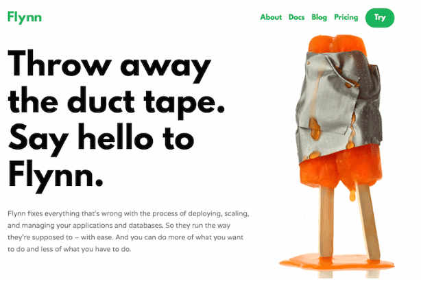
- High-quality image.
- Nice background. The important message in bold.
Semantics3:
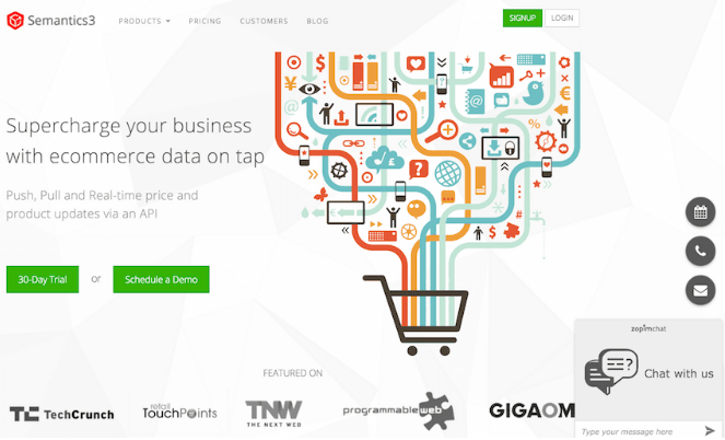
- We love the graphics they have used.
- An excellent colour combination and beautiful design in the graphic.
Adobe Voice:
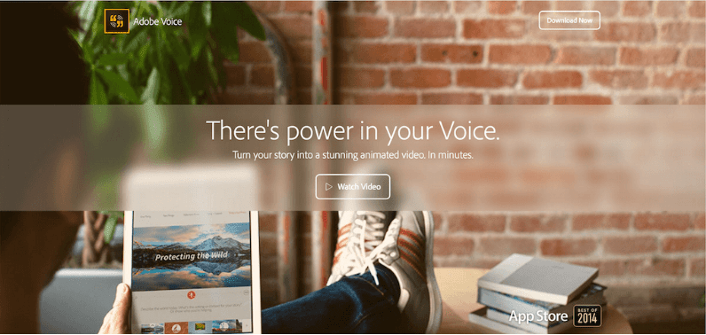
- They have given an option in the centre to know more about the services so you won’t have to search for anything on other pages.
- Nice background and beautifully designed.
Airbnb:
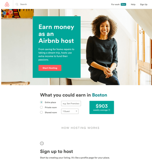
1. Clear to call the action at the top of the page.
2. Nice background and design
Teambit:
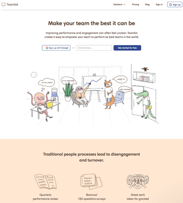
A simple, one-field form is accompanied by a delightful office full of animal characters — all of whom are very pleased with Teambit.
Trulia:
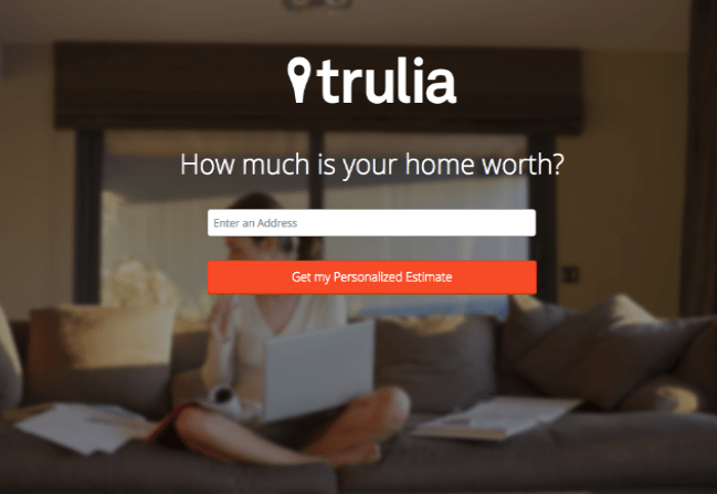
A very simple form asking for an address.
H.BLOOM:
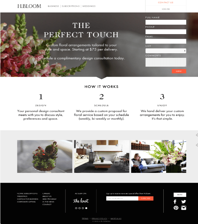
Using high-resolution photography and lots of white space, H.BLOOM’s landing page is a pleasure to look at.
Aside from its beauty, the page has some great conversions elements: an above-the-fold form, clear and concise description of what’ll happen when you fill out the form.
Sales Force:
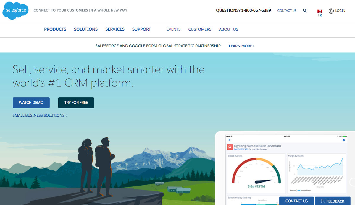
Illustrations and colours are eye catchy. An overview of solutions on Computer-Tablet-Mobile is presented on a background that inspires calm and serenity.
CodeCombat:
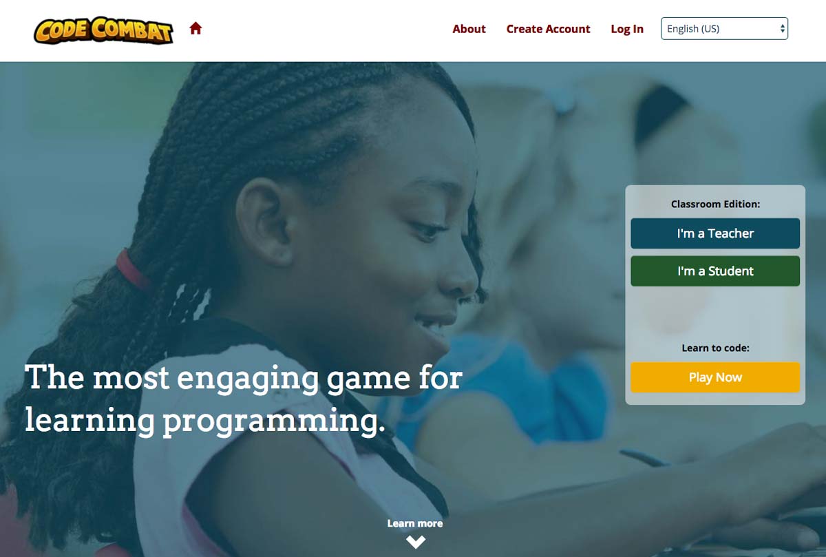
It targets both teachers who wish to use it in class and children who discover it by themselves or through by word of mouth.
Plated:
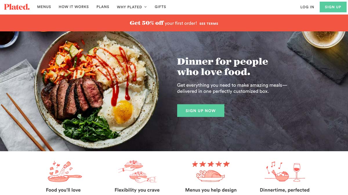
Well created graphic design. The photos of the dishes stand out well and the illustrations are well chosen.
Up Work:
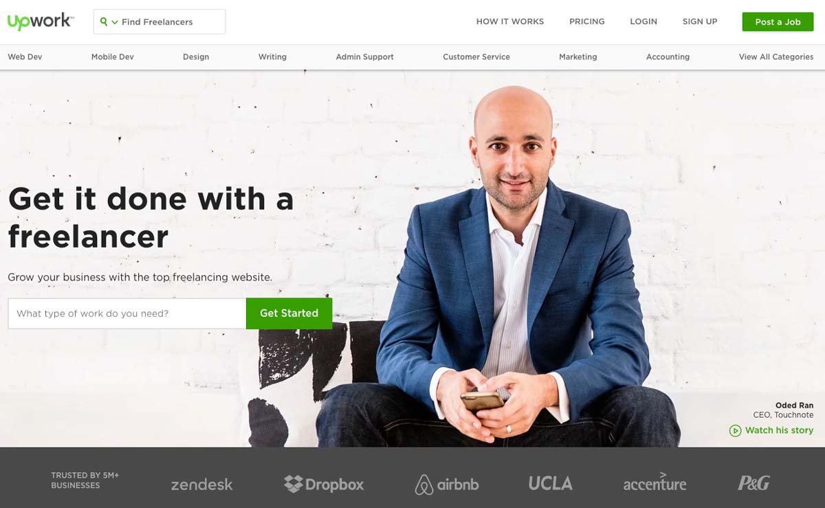
On the homepage, we can see from the outset that the graphical design is clear and that it is the “professional” aspect that is highlighted.
Groupon
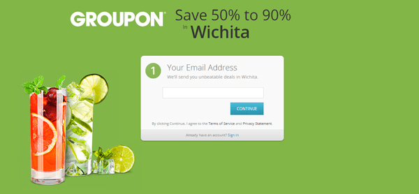
Their headline is simple and personalize.
The form is white and centered on a green background, with only one field required, keeping the barrier to conversion as low as possible.
CampusTap
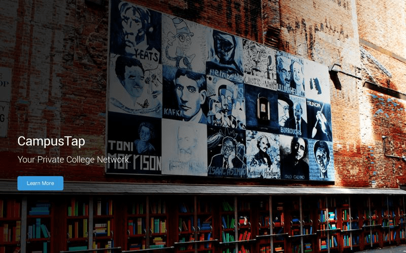
Striking image of a library that directly connects with the company’s value, a private college network.
There’s a limited amount of text, keeping your attention focused.
Vivino
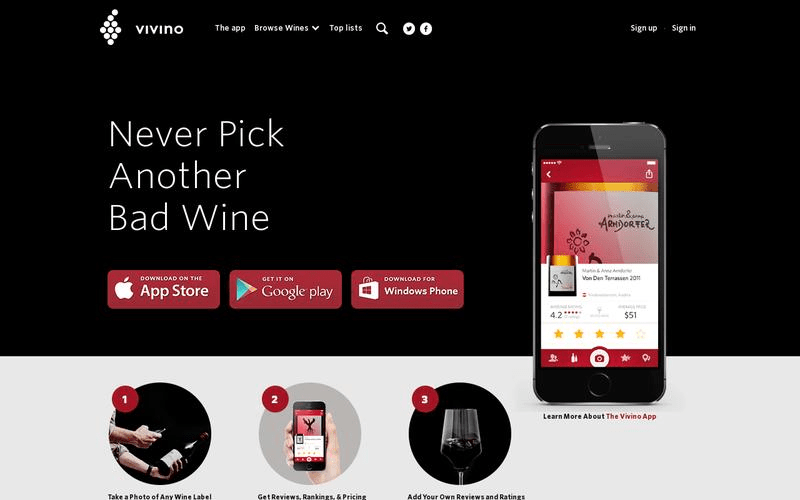
The Use of red here stands out on the black background and it draws the mental connection to wine.
Selling
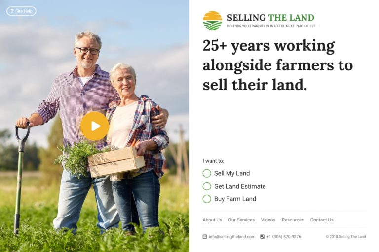
Nice background and design.
We’ll be adding more great examples regularly.
Neil Patel’s website:
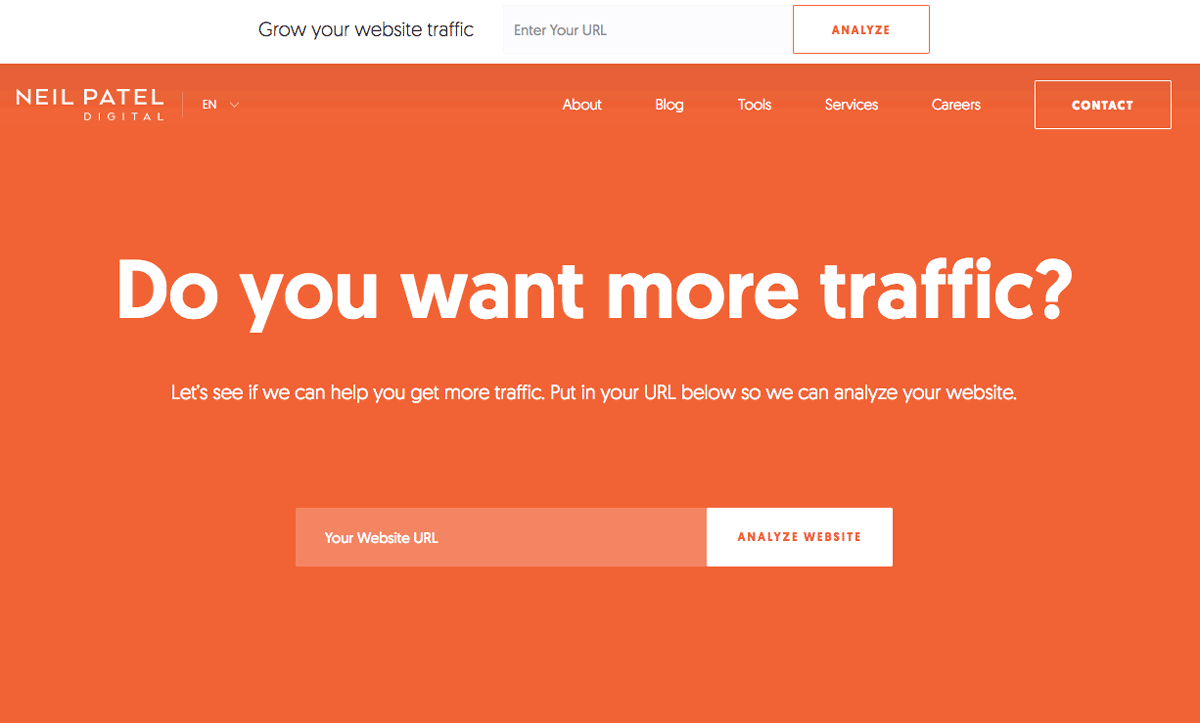
Neil Patel’s site is its uninhibited and straightforward approach to the issue. The colour theme is extremely simple and plays on the contrast between the orange background and the white text.
Airtable Landing Page:
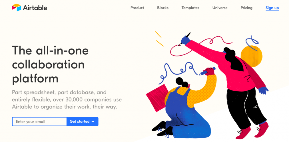
Clean yet whimsical design with a primarily white background, black text, and a colourful illustration.
HootSuite:
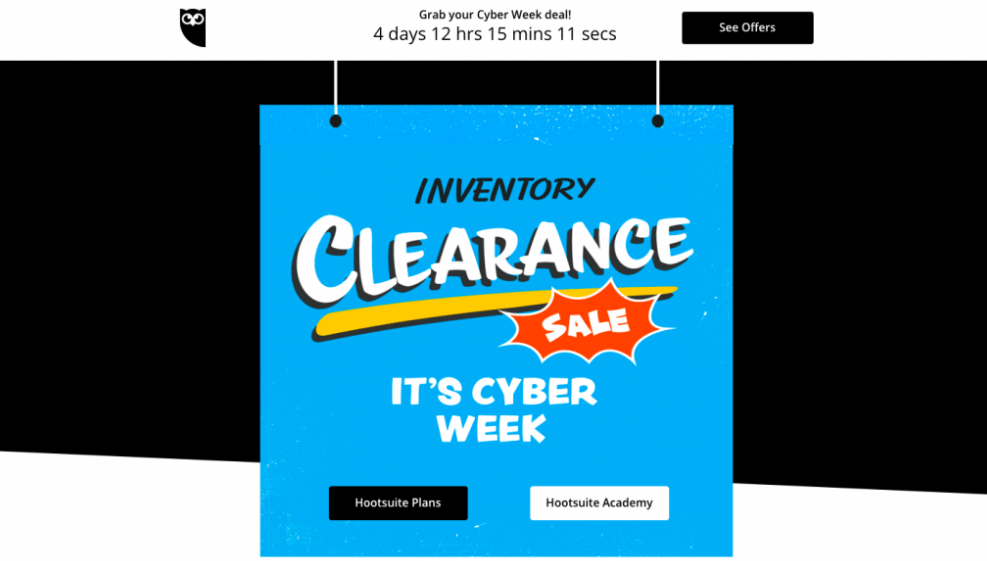
The good colour combination of black background and blue banner. A good example of using limited time to provoke a sense of urgency and drive more conversions.
Wix:
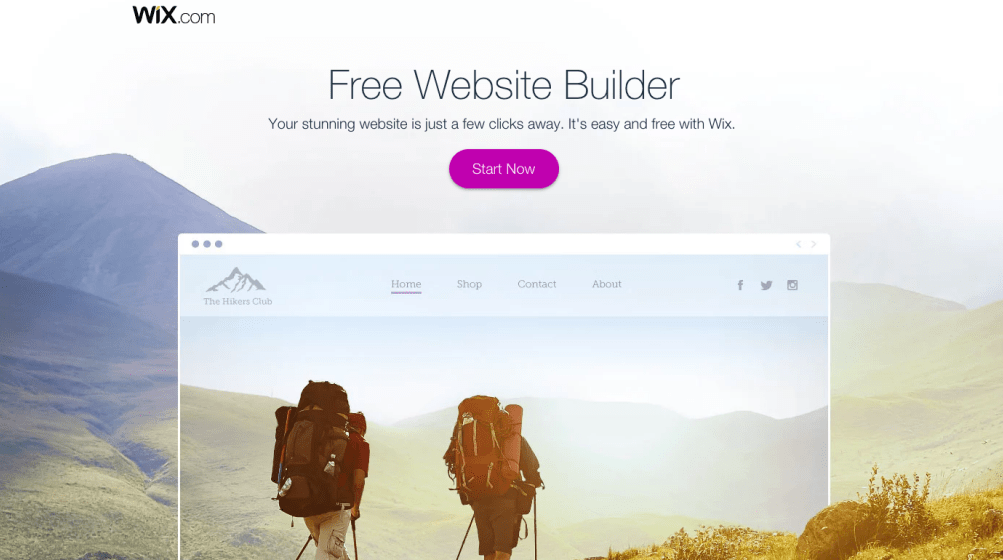
Wix’s landing page is a great example of a clean and visually pleasing landing page. Beautiful background.
Urban Outfitters:
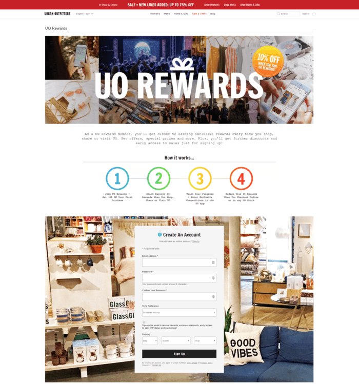
Urban Outfitters prompts its shoppers and potential customers to subscribe to their rewards program.
Zendesk:
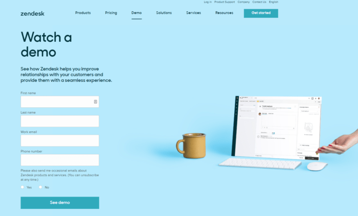
Zendesk offers of the most beautiful website landing page examples. The brand colors vary considerably, it remains SO pleasing to the eye.
Wrike:
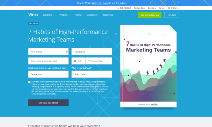
Another whimsical way to use landing pages for lead generation is to offer free ebook downloads.
Offering free content in exchange for an email address is one of the greatest lead magnets ever known to marketers.
Invision:
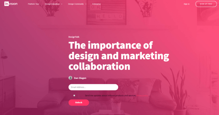
It’s compelling, spot-on, and minimal. There is no other way to make a lasting good impression when you present your webinar than with a good landing page.
Shopify:
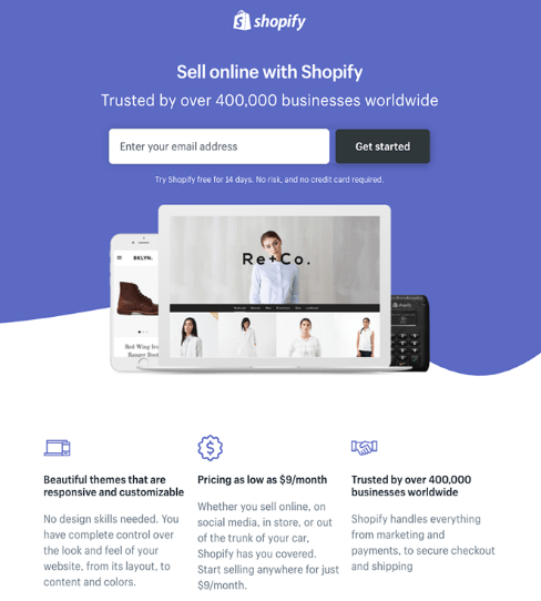
Simple Design and there are only a few fields you need to fill out before you get started.
Industrial Strength Marketing:
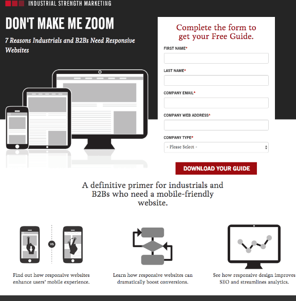
The folks at Industrial Strength Marketing made the fonts and form field big enough so that visitors don’t have to pinch-to-zoom to read and interact with the content.
Focus on black and white colours making the look good.
IMPACT Branding & Design:
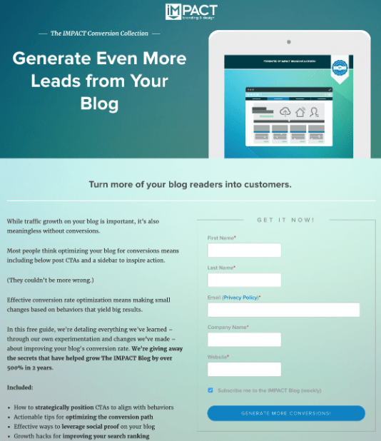
We love the simple layout of the page, from the large headline copy and detailed featured image to the outline that surrounds the form to the colours and fonts that are very pleasing to the eye.
Patron:
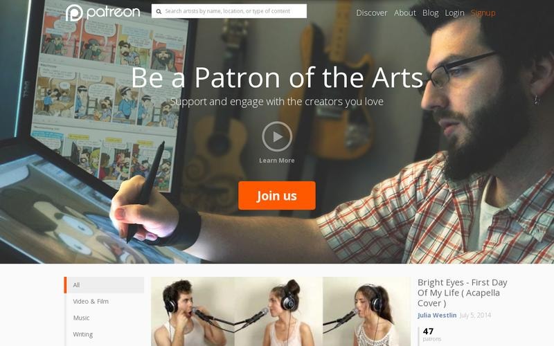
We like the main heading in the page “Be a Patron of the Arts”. Instead of asking you to donate to their cause, they ask you to be a part of the process by supporting and engaging with artists as a “Patron of the Arts.”
Anything on this page unclear? Comment below and we’ll work on it…