

Sources: Google’s Landing Page Optimisation Playbook, CXL, “Conversion Experts” – people who know what they are doing.
There is no “apply this template and it will work” in conversion rate optimisation (CRO), you need data to make informed decisions, to know your audience deeply, and most of all to AB test and prove changes are better – not just rush and guess.
However, in order of where they should be on the page, here is an as-close-to-a-template-as-you-can-get guide. Add these 5 elements and you’ll be well on the right track.
Read my …. letters (?) though: you won’t get far with CRO if you don’t experiment and AB test properly – get some resources on that if you are serious about CRO, half-arsed does not work I’m afraid.

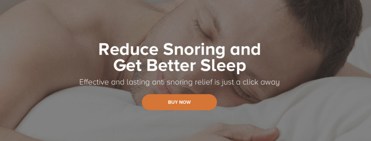
1. A Clear VALUE PROPOSITION above-the-fold (yes, on mobile too)
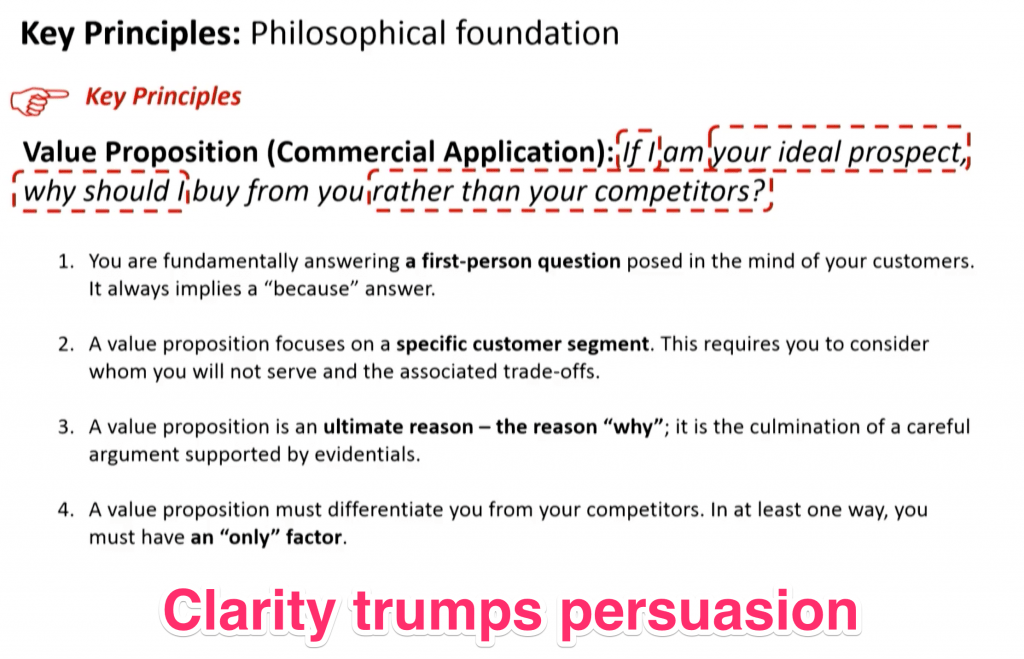
One single VALUE proposition. That’s value, not feature! A value proposition:
- explains how your product solves a problem or eases a pain
- delivers a specific benefit (not feature!)
- tells your ideal customer why they should use you and not a competitor – a differentiating factor
“Has 8gb of RAM” is not a value proposition – you understand it because you live in your product every day. Your customer doesn’t give a damn though.
It can be money related though. A simple “20% off today” or “free shipping” is a value proposition – the value being simple (simple is good): saving money.
Here are some examples:
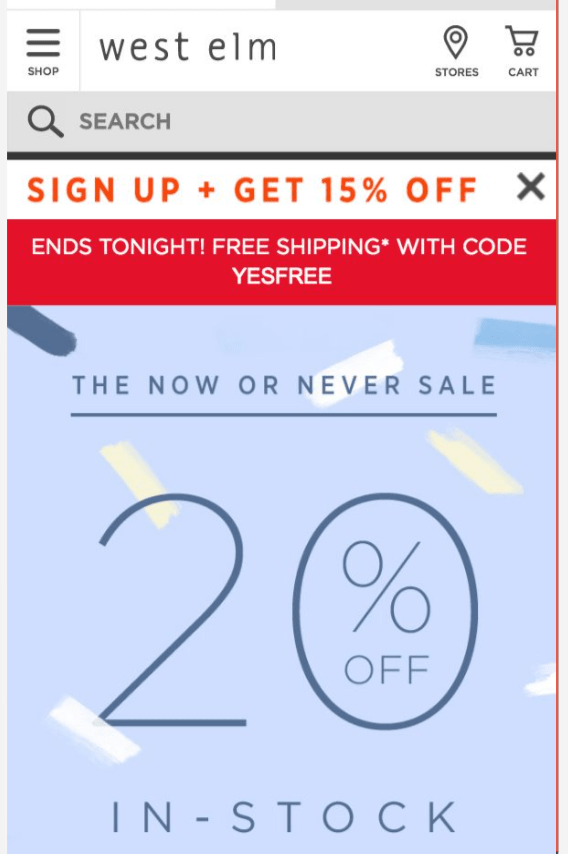
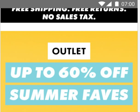
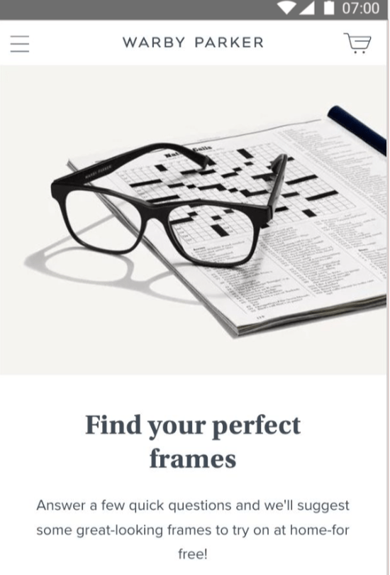
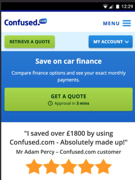
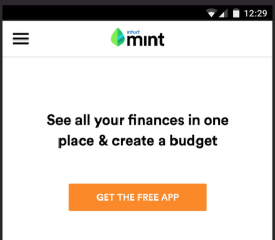
The art is SIMPLICITY: percentage off, free pair of glasses to try at home, get a really quick quote – GET SOMETHING SIMPLE OF VALUE.
For retail, keep repeating the value proposition on category and single product pages.
Here’s a visual courtesy of MEC Labs that may help in designing your value proposition:
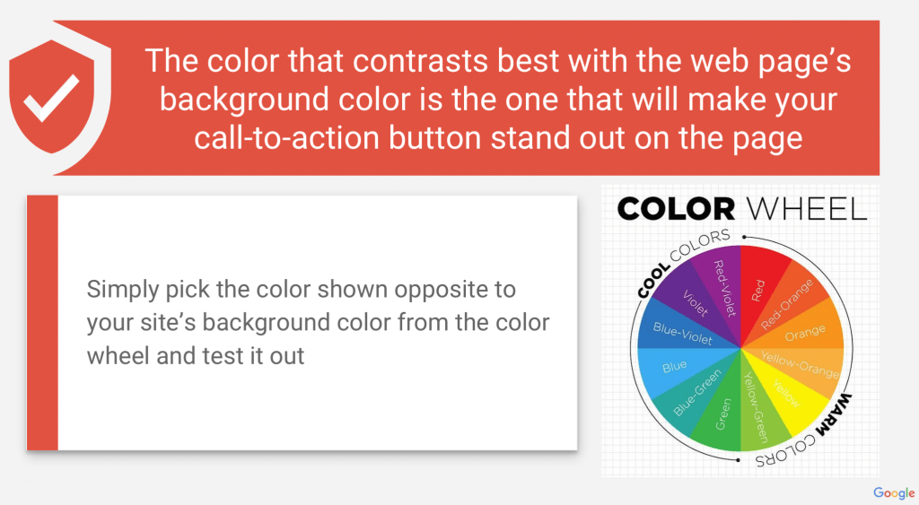
2. A clear CALL-TO-ACTION (CTA) above-the-fold (yes, on mobile too)
The call to action button should be the OPPOSITE COLOUR to the theme of the website.
Yes, your Boss will probably think it should blend in nicely with the rest of the site, but they are wrong and you now know best.
Look at Amazon – “yuk, what a horrible garish orange” your Boss will say:
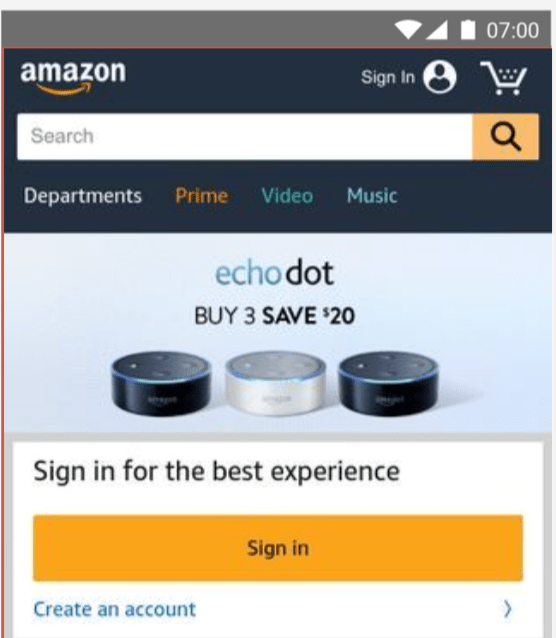
Amazon’s revenues in the trailing twelve months are $208bn at the time of writing, and they are just about to hit a $1trn valuation. They AB test, their site and UX is phenomenal, they really do know better.
Note that not every successful site you see will do this, but the very best do tend to.
Here is a useful colour chart from Google to help you choose your call-to-action colour:
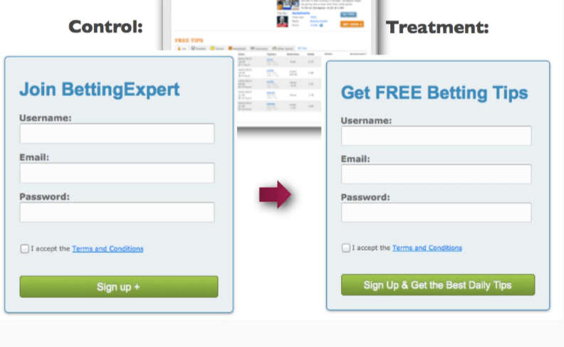
Note that as well as colour, THE TEXT is crucial and should be AB tested too – such minor changes like changing “download now” to “read now” can make huge differences, you are dealing with split-second human decisions – AB test.
Here’s an example of how a simple text change can improve performance by 33%:
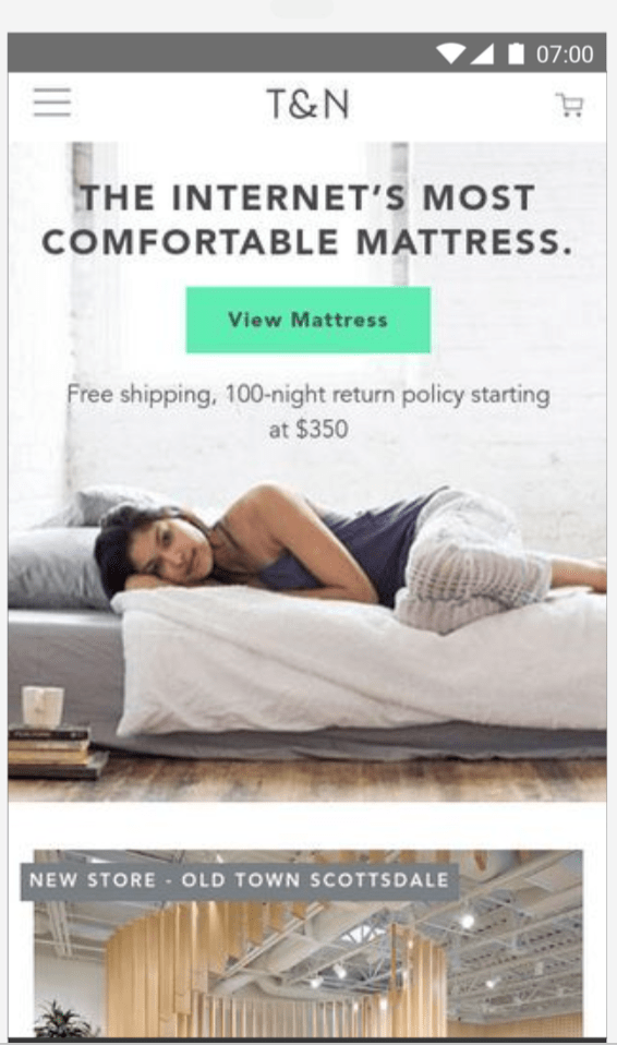
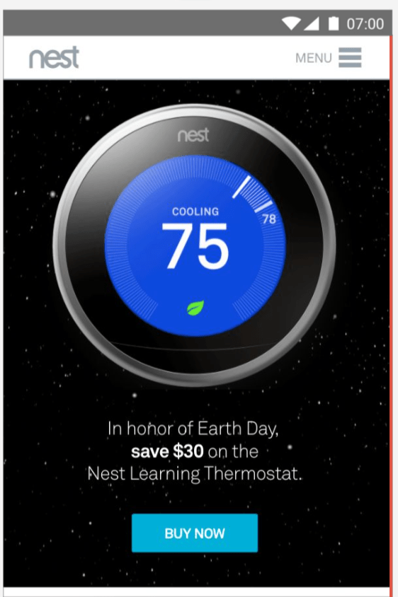
Here are some more great examples of call-to-action buttons (and value propositions):
When you are advertising (anyone with a website is, ultimately), AB test ideas around value props and CTAs – it really is possible to 5x performance from an awful VP+CTA to a great one.
That’s above-the-fold dealt with, and for serious visitors job done. If they aren’t sure yet and want to scroll for more info though……
3. Endorsement Signals
Create a graphic that you can use over and over again like this:

Yes, it works. Human-beings are followers and belongers – “this service MUST be good, other humans have seen it – wow!”.
Obviously, the more recognisable the names are to your type of audience the better.
You can also do clients you work with if they are impressive enough to boost endorphins.
In B2B, case studies and testimonials are the best content for converting people into a purchasing mood.
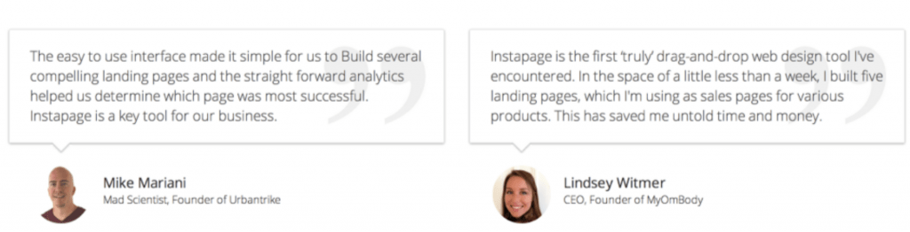
4. Social Proof
Again, your Boss will think “that’s tacky, we’re so much classier than that”. But it works.
And make them REAL. Real people, real faces, and of course real words!
Go make your graphics strip for this too, now – go:
5. Emotional Copy
Facts don’t sell things, or win elections, or get us a mate – emotional connections do. The biggest and best companies in the world know this – YouTube <big company> + <advert> and you’ll see it.
“But our product is far classier than that”. No, it isn’t; “emotion” doesn’t need to smack you in the face. A 55 yr old FD saving time and stress with your product >>> “not getting back home in time for dinner with the family will become a distant memory”.
What to avoid
- Sliders. Sliders, sliders, sliders, sliders – get rid of that slider now.
It’s been proven time and again by the folk who know better than you – get rid of it. - Clever waffle
We see it soooooo much – what could be a very simple, concise message turned into a waffling mess. Choose simple over clever every time.
- Ghost buttons (that blend into the page)
Like this one below. Get them off your page now – go:

Last but not least, an important trend we’re seeing
Rather than guess what visitors want, we are starting to see (and test) many more “quiz” landing pages and calculation tools (based on your answers you could claim/save/whatever)…
This includes ChatBots (“how can I help you today?” or similar).
It makes sense – when you meet someone you don’t jump straight to “will you marry me”, you find out about them first…
So calls to action that take an interest in the visitor and THEN are growing at a pace.
You will need this and also video in your armoury very soon, we have no doubts about it – not just nice to have, absolutely mandatory.