Optin Boxes – You Know, These:
Get your Optin box right, and you can turn 5-10% of your visits in to email addresses, for education marketing, leading to sales and revenue.
So many people get it oh so wrong though.
In this article we run you through the bad, then the good.
Why It Matters
How many visitors do you get a month? We’ll take 10,000 as our example for easy maths.
At a 5% optin rate, you could obtain 500 emails per month – for education marketing, nurture & ultimately sales.
Interjection: to set the expectation, you will not get 5% on all of your pages, on all channels. Unless you are a marketing wizard, the likes of which we have never seen before. If you are, get in touch.
Across the board there is no reason you cannot get 2%.
That’s 200 email addresses of people you know are interested in your topic / service, each month.
Across the year, that’s 2,400 prospective customers you get to communicate with intimately.
For really small traffic sites, take even 10% of these numbers: it’s all relative, and the numbers still make this an important read!
Read on…
What Optin Monster Say
Before we crack on, this advice from Angie at Optin Monster sums up the Lead Box mantra perfectly:
“Point to the problem the customer is having, rather than the actual offering.
For example, the actual offering is advice on what to do at each step of the sales funnel. The problem the customer is having might be something like, “Confused about how to turn strangers into customers?”
The person who downloads your lead magnet is likely confused about what to do next. Or they’re frustrated with having tried lots of things, but without a real system in place for what to do.
If you’ll write copy and use images that speaks to how they’re feeling, the optins will convert better.”
Top 4 Mistakes We See Every Day:
#1 – Me, me, me, me, me, me, me
Sign up to MY newsletter, WE are amazing, OUR product, MEEEEEEEEEEE.
People don’t care. Well some people might, competitors and blog writers signing up to get content & service ideas, but that’s about it.
Every Popup box you make must be about your VISITOR.
Who are they? What would they want? How do you offer them value?
Example: you are a Garden Centre, and you just wrote a blog post about getting growing the perfect tomatoes.
Should your popup box say:-
a) “Buy our Garden Centre stuff, we’re great. And can I have your email address?”
b) 5 steps to perfect tomatoes – download our tomato growing checklist
You get the idea.
#2 – Sign up to our newsletter
Yawn. What? Newsletter? Oh. Yawn.
Similar to #1, this is of no benefit to me, the visitor. It is all about you.
To be clear – there is absolutely NOTHING wrong with having a newsletter. Newsletters can be great, if they are created for the audience and not just vanity.
We’re talking about the opt-in message “sign up to our newsletter”, “stay up to date with our newsletter” (stay up to date with what?).
GET SPECIFIC.
#3 – Too Many Options
This one applies generally to any service page or lead page too.
Some pages are so cramped with options it becomes overwhelming to the visitor. The human brain can only handle so much.
This is why lead pages offering just 1 action or disappear can be so effective (caveat: if the copy is good).
I want to be told what to do. I want to make a simple yes/no decision on that, and get on with my life.
Asking me to book a demo, sign up to your blog, call you, email you, buy your e-book, download your PDF and read your news – aaaaaagh.
Let’s remind ourselves how Google dominated the Search market, amidst competitors who were search-news-blog-link-mish-mashes:
Each of your web pages is designed for a purpose. Select 1, maximum 2 options on the page for your visitors to relax in to.
Kissmetrics wrote a fantastic blog on too much choice, read it in full here.
Even worse = no call to action at all! Text, text, text, thanks very much, see ya.
#4 – Be Realistic
You want to get to the sale as quickly as possible, we know that. But you have to be realistic.
Some of your visitors will be in more of a rush, hopefully you get some direct contact immediately. Just don’t rely on it.
MICRO conversions are a first step down the sales funnel.
1 – ask me to do something
2 – make it compelling and realistic
I won’t buy a Porsche based on my first visit to a review page. I might download or request a hard copy of a brochure with contact details on, to peruse over my weekend.
What is the price point of what you sell?
Get realistic, work on your whole funnel and avoid the temptation of straight-to-purchase.
Mistakes Conclusions
If you are making any of these three mistakes, go off and fix them now!
Now let’s look at the successful popup boxes.
3 Popup Box Winners
There are some common elements to these winning popup boxes.
#1 – they are carefully thought out, with intelligent triggers – the right time
#2 – they are simple
#3 – they are compelling
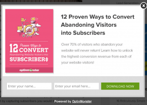
#1 – Optin Monster Newsletter – Yes, Newsletter!
Our friends at Optin Monster give visitors a very good reason to sign up to their newsletter/blog:
Social proof – tick.
What will I get – tick.
Will it benefit me – tick.
If you have “sign up to our newsletter” as your copy, go and change it right now! We’ll wait…
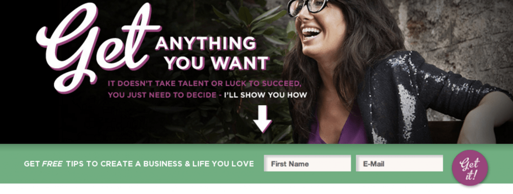
#2 – Marie Forleo Motivational Stuff
Do I want a better business life? YES
Do I want a better life in general? YES I DO
Do I want anything I want? HELL YES
Do I want it for free, from a lady who looks really happy? YES!!
Yes it’s cheesy, but put this in to context:
- a largely American audience
- a brand discovered relative to motivational & coaching searches and articles
- this is EXACTLY what the audience is looking for
- the crux of their problem has been identified
- It’s a micro first step in a much longer sales funnel to purchase courses, webinars, coaching etc…
#3 – Problogger’s Floating Bar
It’s easy – 31 days
It’s guaranteed – wow
I’m only here if I’m a blogger, again it gets to the CRUX of the audience’s problem.
Conclusion & Actions You Can Take
There you have it, what not to do, and what to do. There’s no rocket science here, it’s all simple stuff. Yet the majority of people do it badly.
If you are the one in your industry doing it right, you can reap rewards, as seen in our earlier maths.
Think about these things:
- Who are my audience?
- What is the CRUX of their problem?
- How do I get to it?
- What can I give, of value TO THEM?
Apply that to your optins, make the copy compelling, and you’re set.
We love to hear your views, please don’t be shy – any questions or discussion, leave a comment below.


